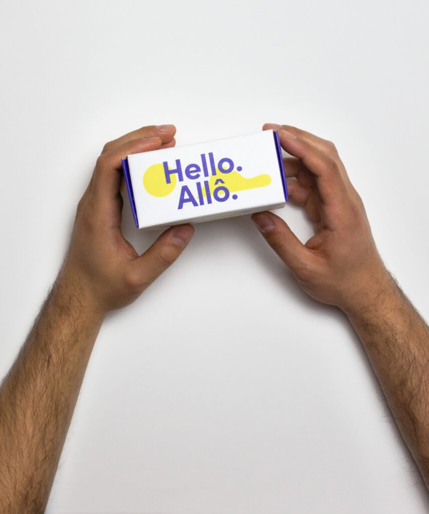
Over the past twenty years, web design has changed dramatically.
We’ve seen sites that are very bleak with simple text to oversized graphics to flat design. It’s a constantly changing field. In 2018, you will notice more bold typography, vibrant colors, animation and illustration, videos, and mobile prioritization. Now, more than ever, are we witnessing the creative side of web development.
Bold Typography
Typography has always been straightforward, simple and constant throughout the years of web design. Now with more browsers supporting custom typefaces and the new variable fonts project, designers have more freedom. You’ll specifically be seeing an increase in different types of serif and sans serif, different width, weight, and spacing between words.
Vibrant Colors
It’s the year of color, and anything goes! What we mean by this is you’ll be seeing more vibrant colors instead of “safe” ones. You’ll be seeing bright blues, pinks, greens, and many more! The reason why so many people are using these colors is that they stand out more and attract users/customers and can have an impact on what they buy or not buy. You will also see designers take advantage of this new trend with the use of saturated gradients for backgrounds and layered colored backgrounds.
Animation and Illustration
More companies are turning to animation and illustration to help present their content. Animation and illustration add a more personal and interactive experience for users. So keep an eye out for animated logos, the transition between sections, and mouseover effects. Also keep a lookout for custom playful illustration. Illustration can be a great way to show a playful side of a company and an easy way to get their content across in a fun way. All in all, adding these two things to your web design will make your website attractive for users and will have an impact on how long they stay on your site.
Video
HTML5 has given us the ability to present video on our sites in a continuous loop. Video has become a way to add movement to your site. It’s a great way to display your product and again create an interactive, personal experience for your users. A lot of sites are using video on their homepage as almost a banner or even as their whole background.
Mobile Prioritization
Fact: more users browse websites from mobile than desktop. A big reason for this is because more people are shopping or browsing on their phone due to the convenience and ease of access. Another reason mobile first will be seen in 2018 is that Google has been creating a “Mobile First Index” since 2016. This will be used to prioritize the mobile version of your site in the search engine.
As you can see 2018 will be a great year for web design and will really display the creative aspect of web development. We look forward to seeing and using these trends in 2018!