
Aurora is one of Canada’s leading medical cannabis companies, and they came to us looking to modernize their website and improve the overall experience for both patients and healthcare professionals.

We started with a series of stakeholder meetings to understand what was working on the current site and where things were falling short. These sessions gave us a clear picture of the team’s goals, user pain points, and the opportunities we could tackle in the redesign.
From there, we put together a strategy that included updated branding, a refined messaging direction, and new client scenarios to help better connect with Aurora’s audiences. We made sure the whole team was aligned before diving into design.
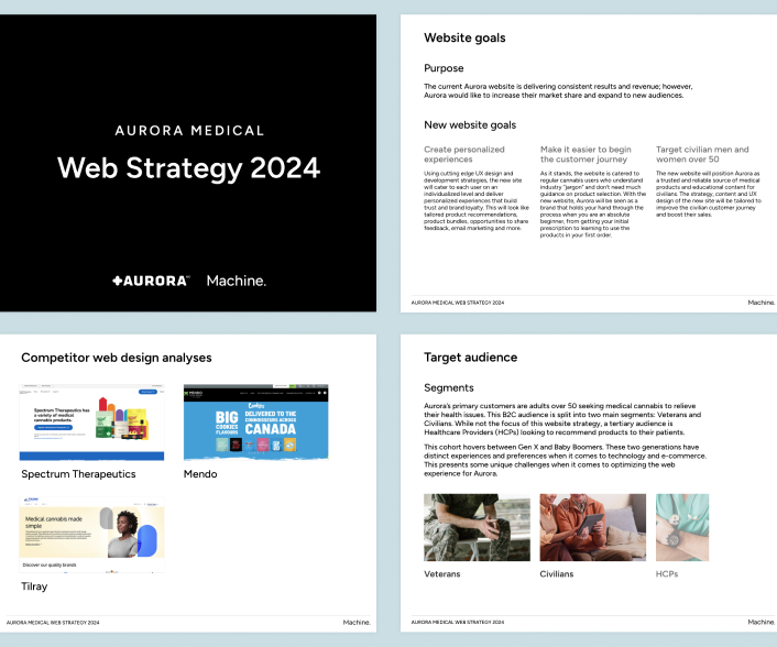
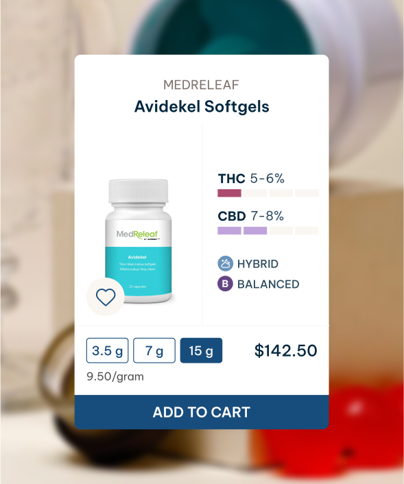
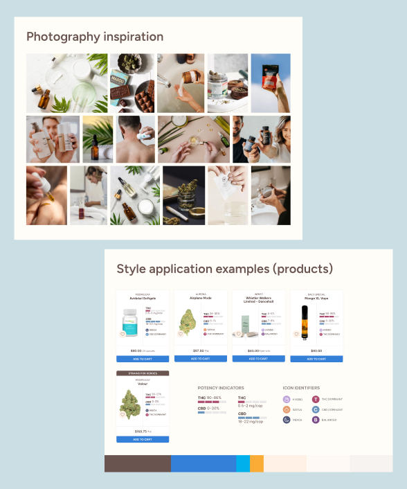
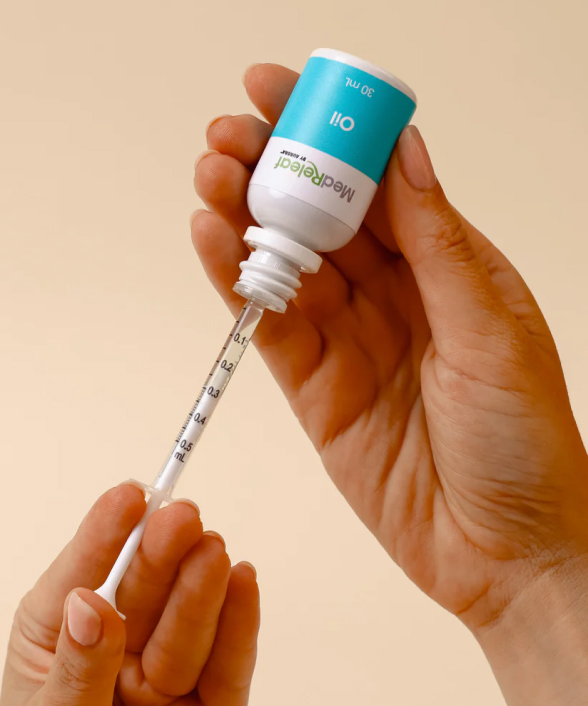
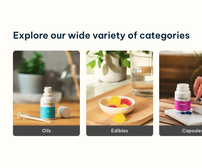
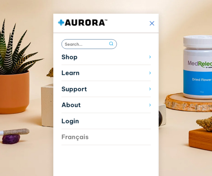
For the design phase, we shared mood boards with a few different visual directions. This helped us get early feedback on tone and style before building out the full layout. The final design focused on clean visuals, easy navigation, and making key information accessible and clear.
The end result was a refreshed site that not only looks great but also supports Aurora’s mission more effectively. The team was really happy with the outcome, and the site is now a key part of their digital presence.
See what else we’ve done


Canadian Museum of Nature
Exhibit Interactive Design, Development, Installation, and Maintenance
We’ve been busy…
Check out all of our latest projects