Machine is an interdisciplinary design and development agency focused on creating beautiful, functional, manageable digital experiences.
-

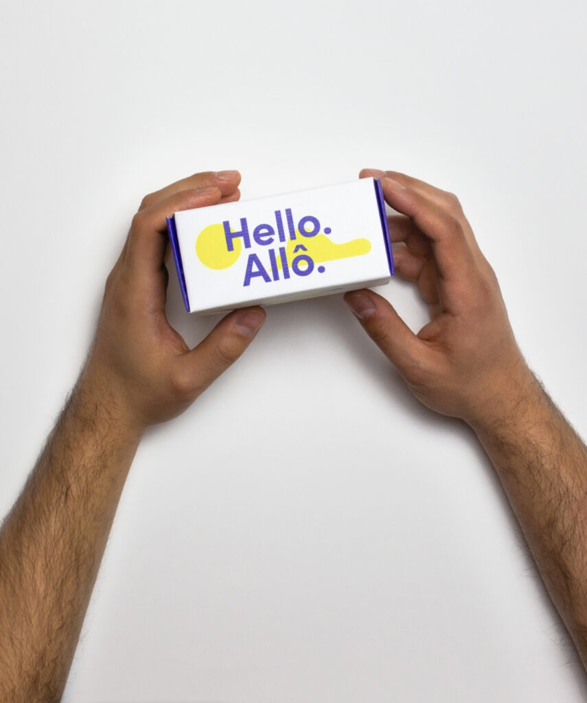
Wibbi
Design and Development
-
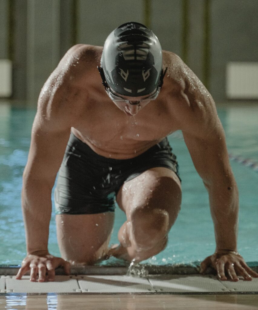
Swimming Canada
Donation Platform Design, Development, and Maintenance
-
GetaKit
Application Strategy, Design, Development, and Maintenance
Have a project in mind?
Email [email protected] or request a quote.